
I. Intro
You can add area charts to dashboards in Base to show how data changes over time and the proportional relationships between data. For instance, you can use area charts to show growth in sales performance, forward movement in project progress, and so on.
Note: Charts can be viewed on the mobile app (Lark version 7.32 or above), but adding or editing them isn't supported.
II. Steps
Add an area chart
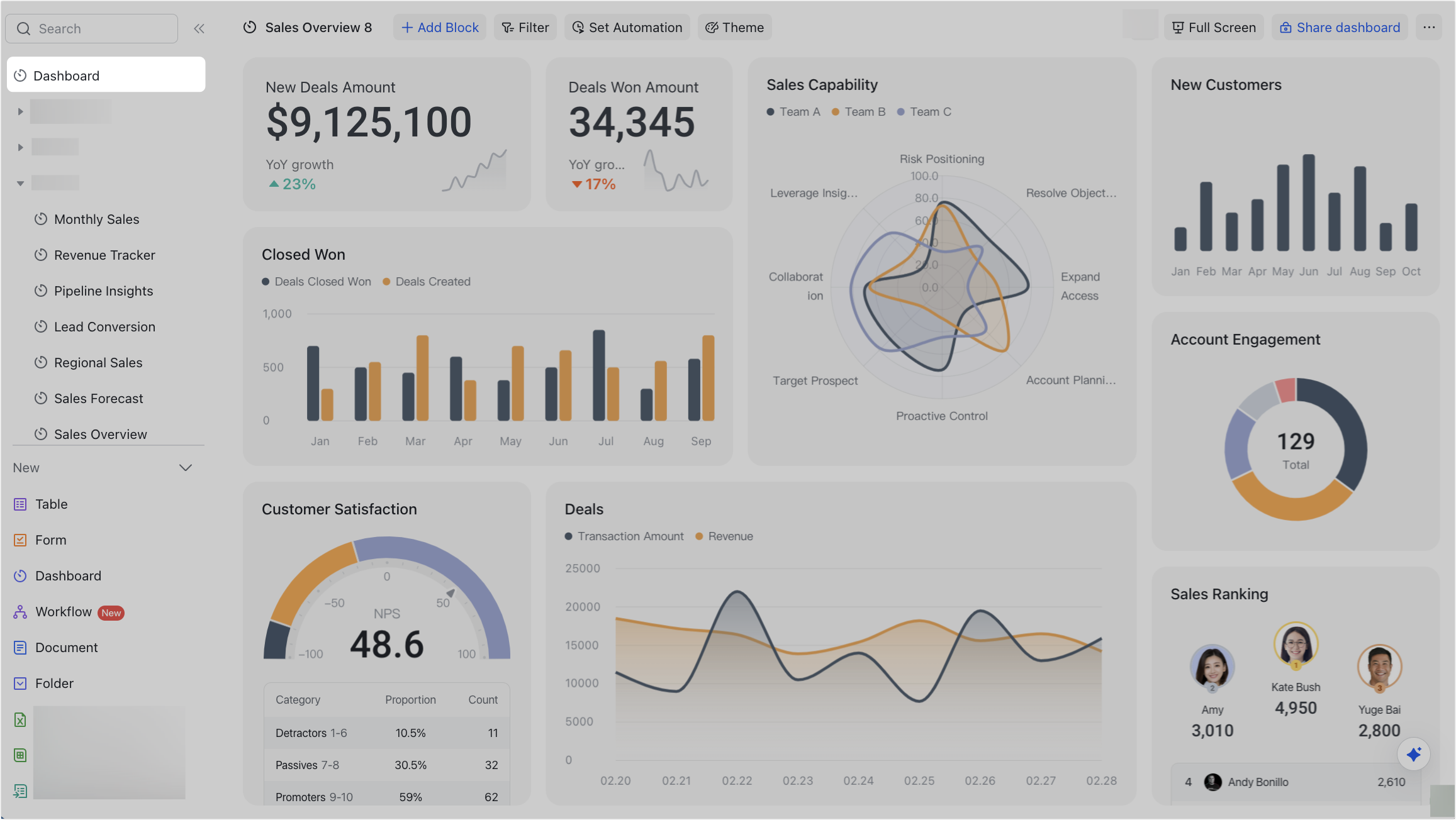
- Open the base and click Dashboard on the left navigation bar.
250px|700px|reset
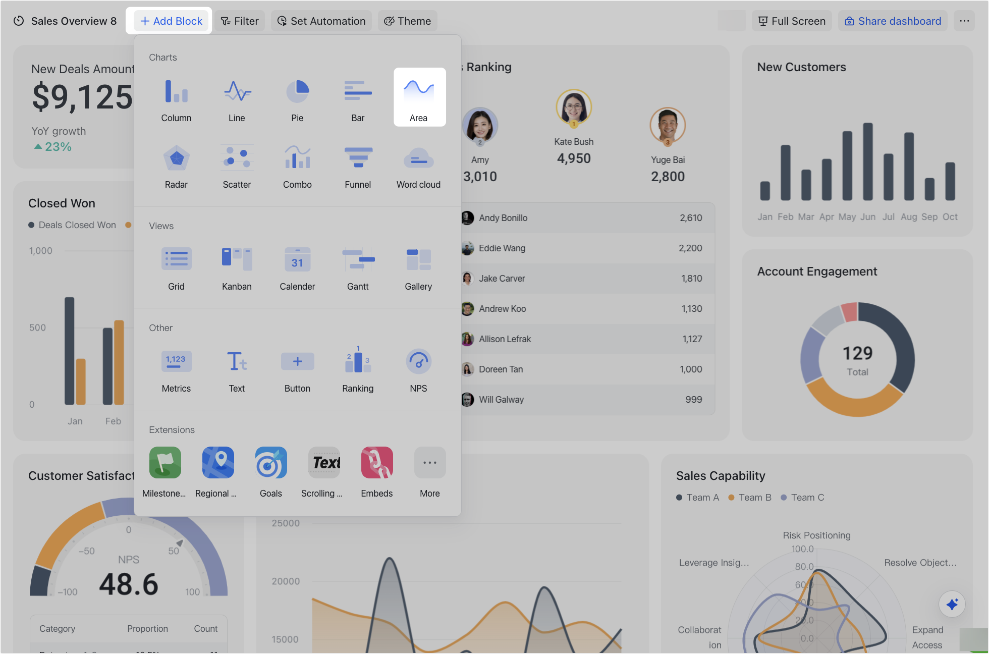
- At the top, click Add Block and select Area under Charts.
250px|700px|reset
Configure an area chart
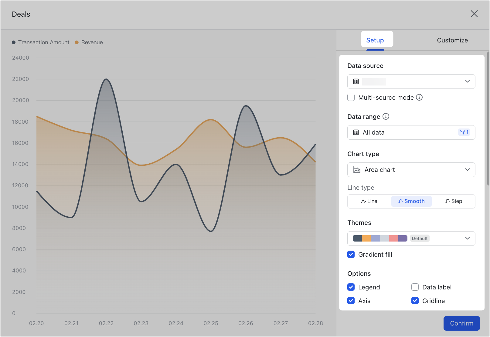
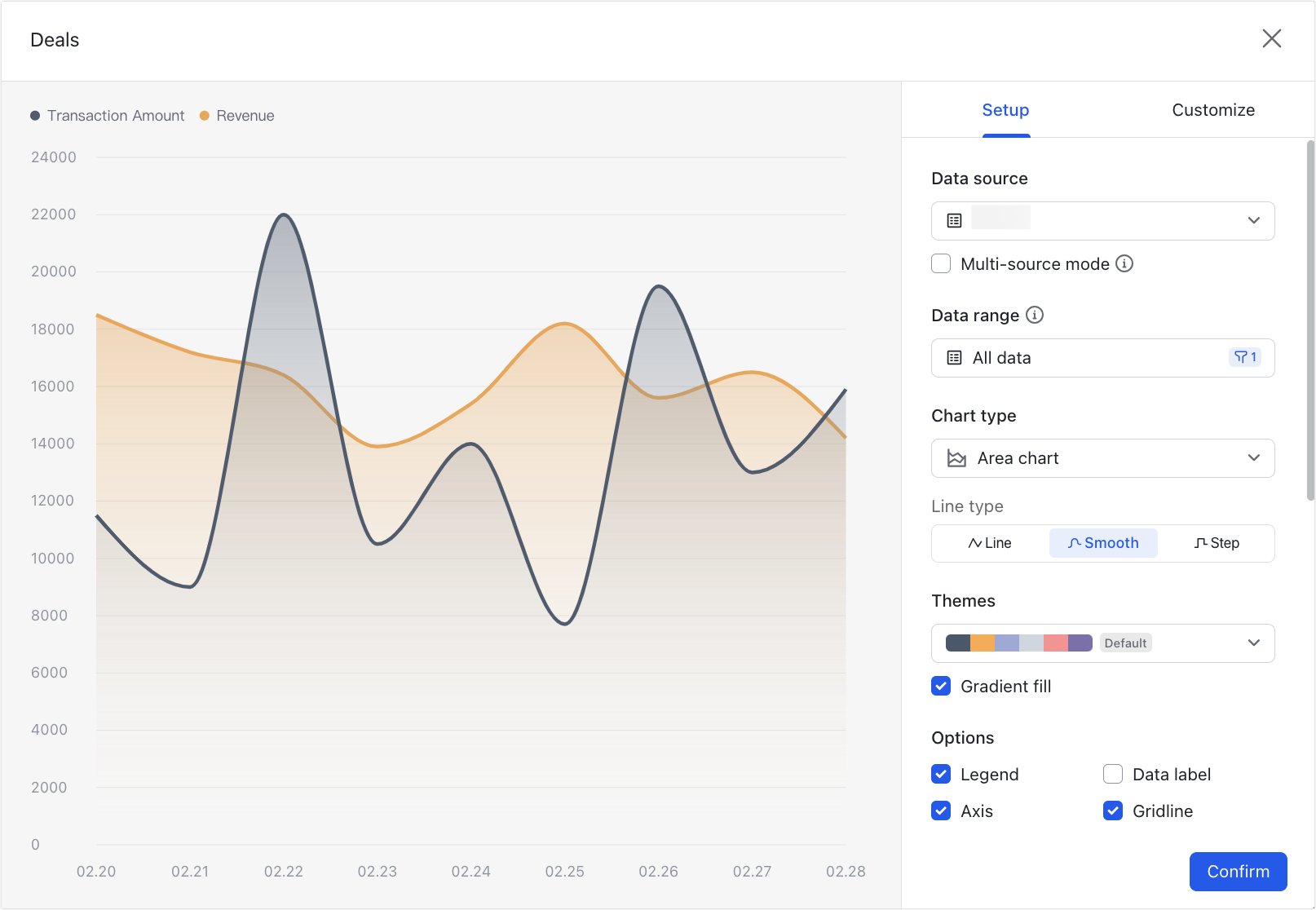
After adding an area chart, you can configure its block type, data, and style.
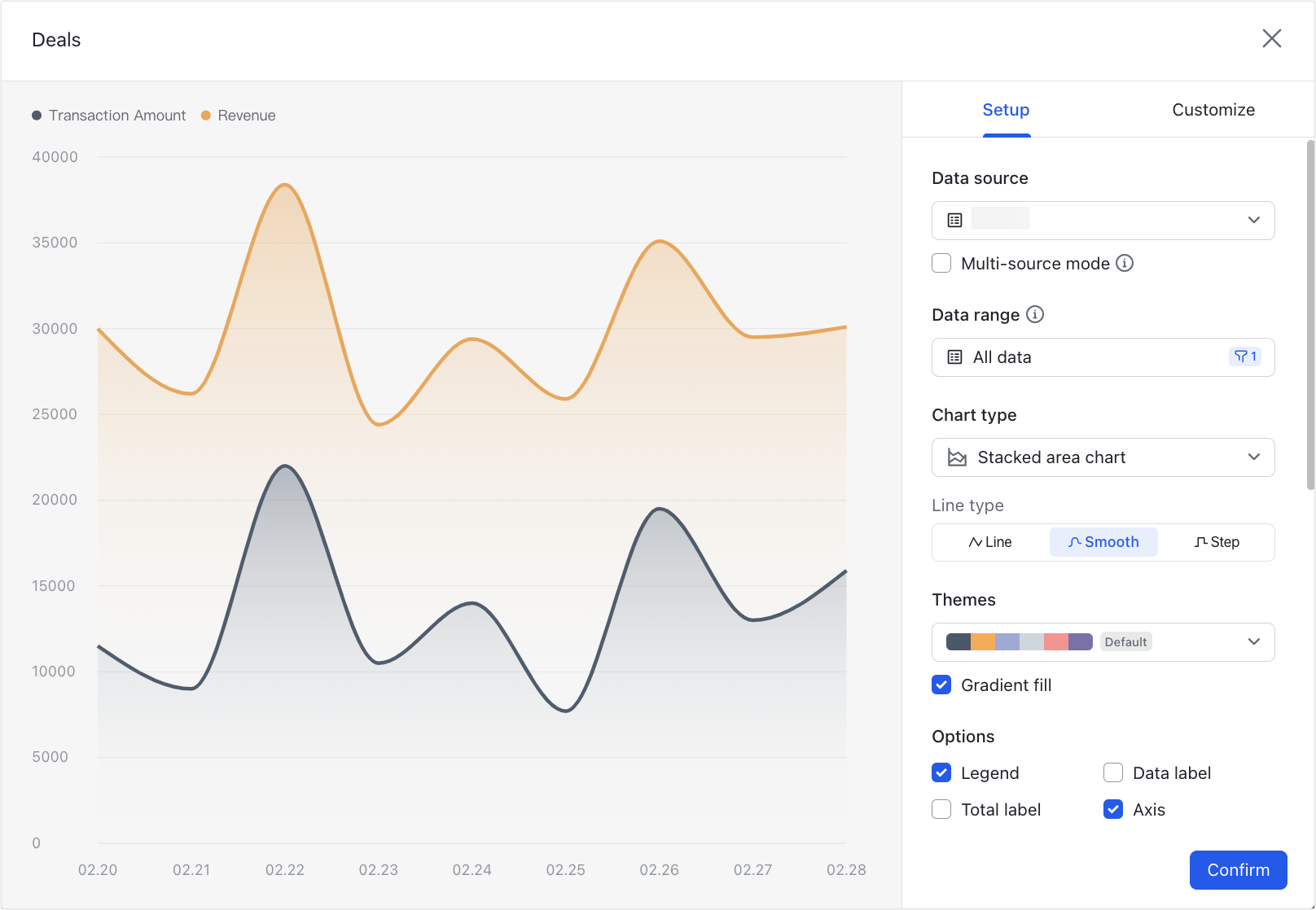
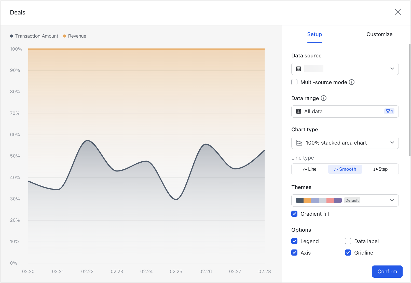
- You can configure the following settings under the Setup tab:
250px|700px|reset
- Data source: You can select any table in the current base as the data source for the block. If your Lark plan supports multiple data sources, you can select Multi-source mode to select multiple tables to be used as the data source.
- Data range: You can select a view from the table or set a filter scope to filter for the data you need.
- Chart type: You can select Area chart (default), Stacked area chart, or 100% stacked area chart.
- Area chart (default): Holding the same information as a line chart, an area chart can more clearly show comparisons of the absolute value of each series.
250px|700px|reset
- Stacked area chart: This is similar to the area chart, but each data series is added on top of the previous series along the x-axis. Stacked area charts can not only show differences in data of different types in the same category, but can also show the differences between the sums of each type in the same category.
250px|700px|reset
- 100% stacked area chart: This is similar to the stacked area chart, but the data is expressed as percentages. The height of the stacks indicates their percentage of the total height, making it easy to compare relative weights and changes.
250px|700px|reset
- Line type: You can select Line (default), Smooth, or Step.
- Themes: You can change the theme color for the chart.
- Gradient fill: You can select this option to display the theme color in the form of a gradient within the area chart. This is selected by default.
- Options: You can choose whether to display the legend, data labels, axes, and gridlines.
- X-axis (category): You can select the data fields to be displayed from the source table.
- Y-axis (field): You can select Number of records (default) or Field summary.
- Number of records: The number of records is added up.
- Field summary: This can only be selected if there are number fields or formula fields in the table. The available calculation methods include Sum, Max, Min, or Average.
- Group by: If this option is selected, the data will be divided into different groups and data processing will then be carried out within the groups. For more information, see Use dashboards in Base.
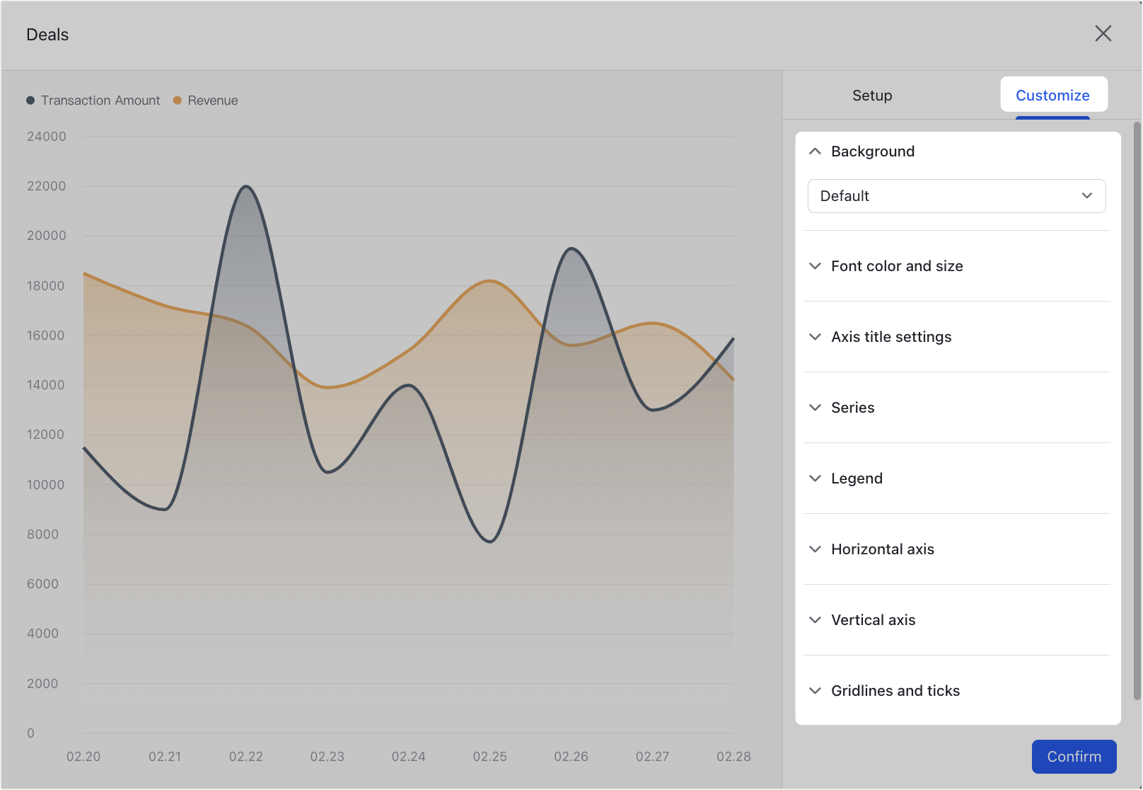
- You can configure the following settings under the Customize tab:
250px|700px|reset
- Background: You can set a custom background color for the area chart.
- Font color and size: You can set the color and size of all text in the area chart.
- Axis title settings: You can set the title as well as the text color, formatting, and so on for the two axes.
- Series: Series refers to each data module for group aggregation. Without group aggregation, there is only one series. You can set the series style, data point formatting, and data labels.
- Series style: You can set the fill color, border, and so on for each series.
- Data point style: This can be used to mark key data in each series (such as the maximum value and minimum value).
- Show data labels: If this option is selected, you can set the label text, position, text style, and so on.
- Legend: You can set the position and text style for the legend.
- Horizontal axis: You can set whether the data labels and gridlines of the horizontal axis are displayed, and adjust label orientation as well as text style.
- Vertical axis: You can set whether the data labels and gridlines of the vertical axis are displayed, and adjust label orientation as well as text style. You can also define maximum and minimum values.
- Gridlines and ticks: You can set the gridlines for both axes and the ticks for the vertical axis, as well as their colors and thickness.
After completing the settings, click Confirm in the lower-right corner to add the area chart to your dashboard.
Note: You can add multiple data sources for an area chart. For more information on configuring data sources, see Add multiple data sources to dashboard blocks.
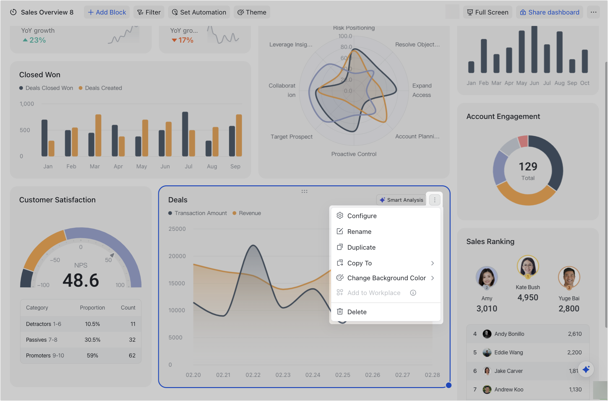
Manage an area chart
Click the ⋮ icon in the upper-right corner of the block to configure, duplicate, delete, change its background color, or copy it to another dashboard. Area charts cannot be added to Workplace.
You can also select the block and drag the lower-right corner to adjust the block size or drag the top of the block to move it.
250px|700px|reset
III. FAQs