
I. Intro
Platform requirement: These steps can only be performed on the Lark desktop app.
A scatter chart is a type of chart in Sheets used to display the relationship between two variables. By arranging and distributing data points, you can intuitively understand the data correlation between the two variables, such as linear relationships, nonlinear relationships, positive correlations, negative correlations, and so on.
II. Steps
- Insert a scatter chart
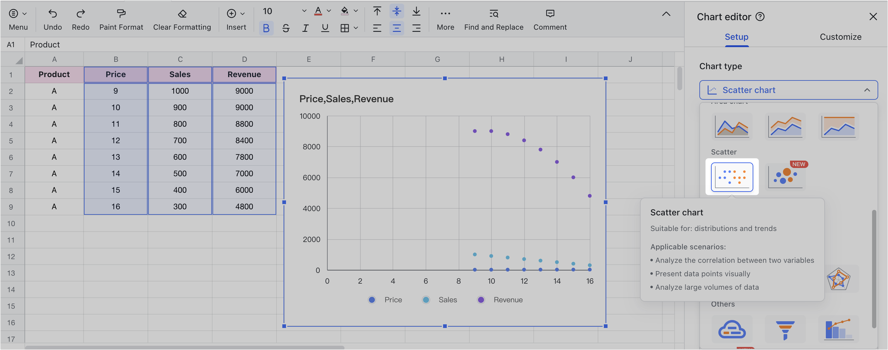
Open the Sheets file and click Insert > Chart on the toolbar to open the Chart editor pane on the right. Find Chart type on the Chart editor pane, then select Scatter chart.
250px|700px|reset
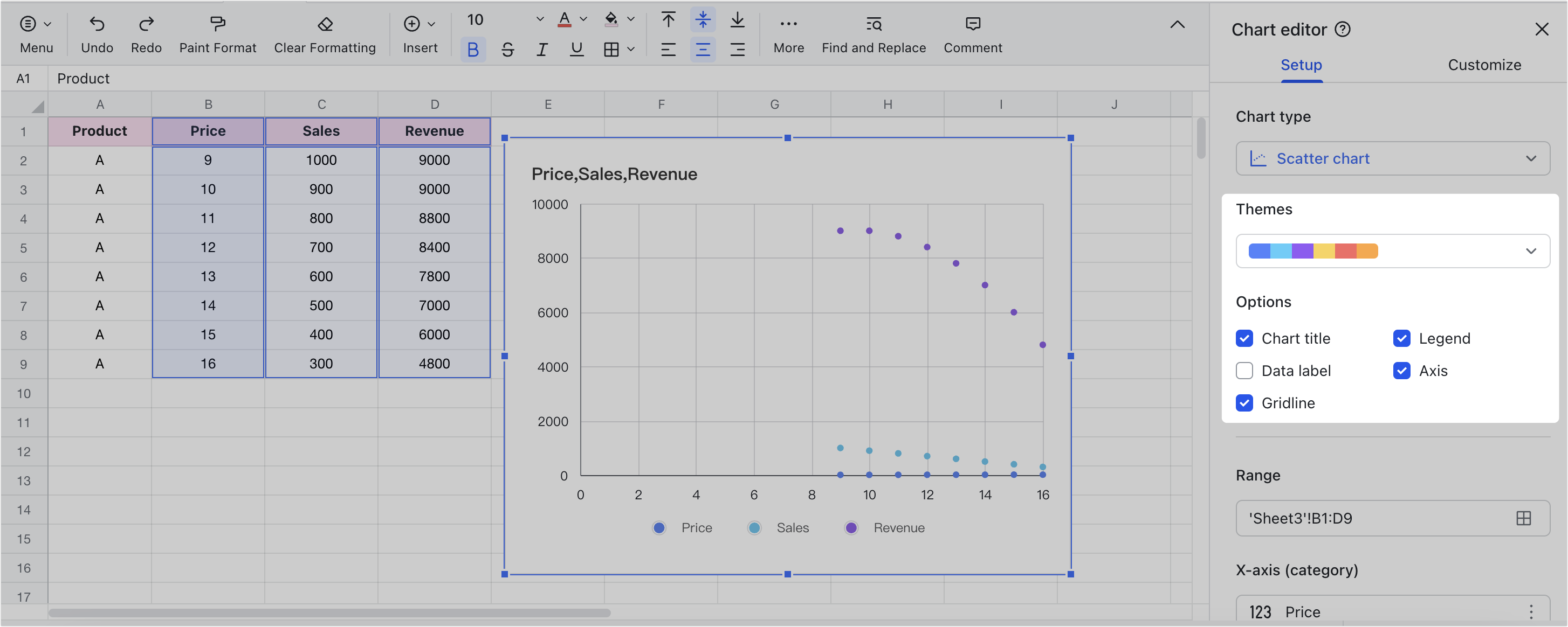
- Set the theme color and configure options
In Setup > Themes, choose the theme color for the scatter chart.
In Setup > Options, select whether to display the chart title, legend, data labels, axis, and gridlines.
250px|700px|reset
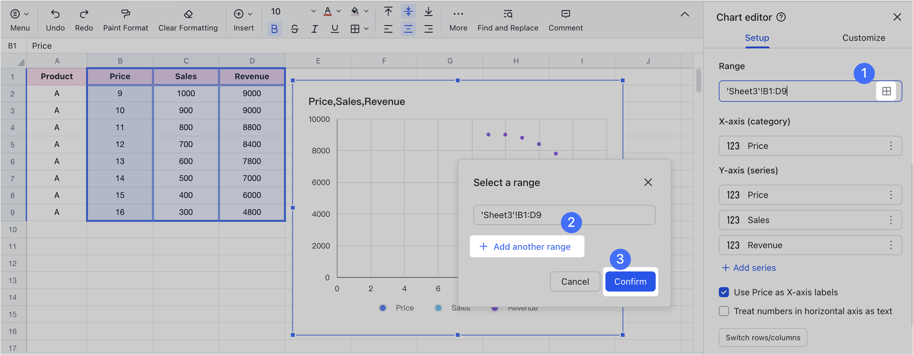
- Select the data range
In Setup > Range, click the Grid icon. Enter the data range in the popup window, or select the data range with the mouse, and click Confirm. If you want to add multiple data ranges, you can click Add another range after clicking the Grid icon.
250px|700px|reset
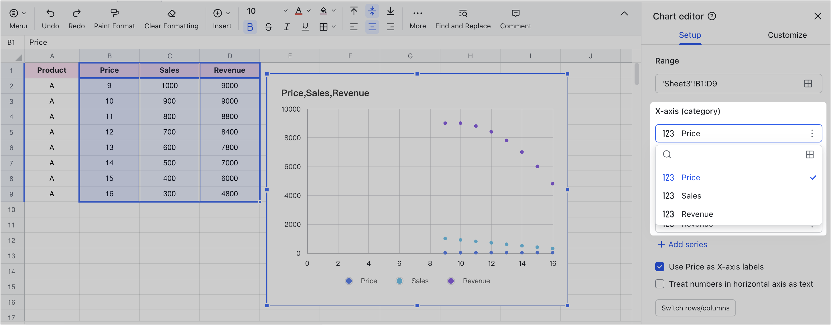
- Edit the horizontal and vertical axes
After selecting the data range, you can edit the x-axis and y-axis. In the dropdown menu, select the corresponding data, or click the Grid icon to choose the data range.
250px|700px|reset
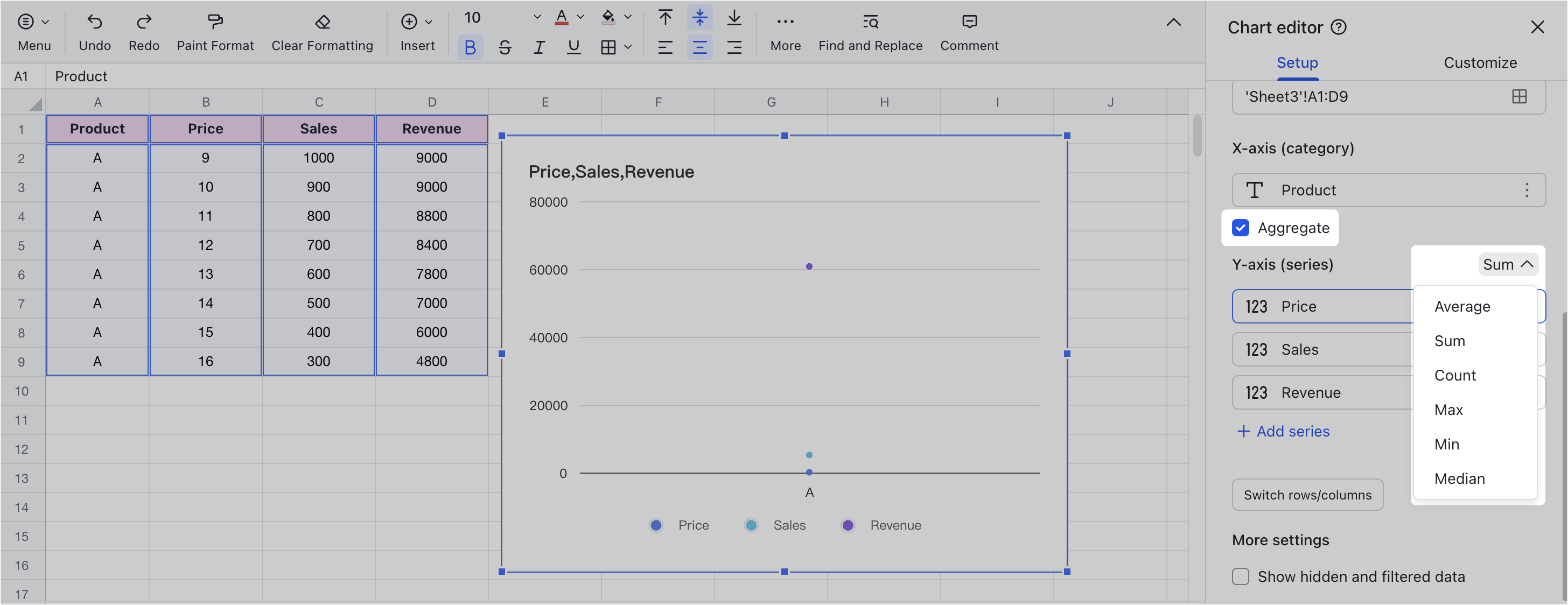
You can also perform summary calculations on data of the same category. In the Y-axis (category), select Aggregate, and the data of the same category in the chart will be automatically summarized. You can also choose summary calculation methods such as Average, Sum, Count, Max, Min, and Median in the X-axis (series).
250px|700px|reset
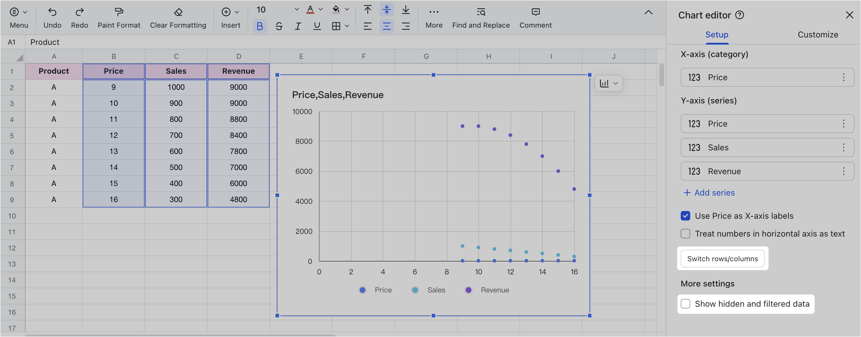
If you want to display the data of the X-axis on the Y-axis or the data of the Y-axis on the X-axis, you can click Switch rows/columns to switch the X-axis and Y-axis. If the source data is not displayed because it is hidden or filtered, you can select Show hidden and filtered data to display the data in the chart.
250px|700px|reset
- Customize Style
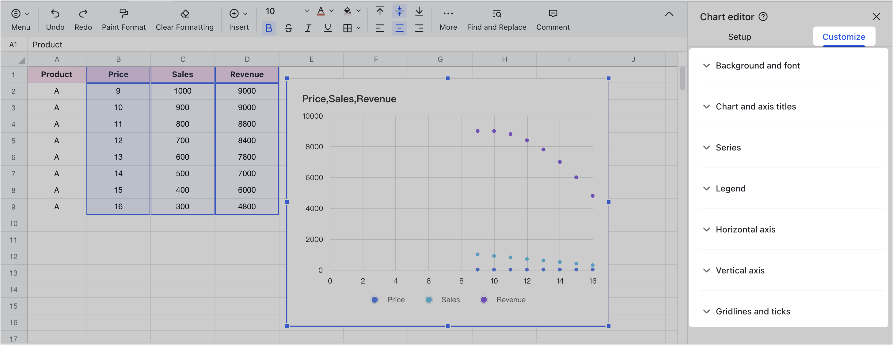
On the Customize tab, you can further set chart background and font, chart and axis titles, series, legend, vertical axis, horizontal axis, and gridlines and ticks. For more details on configuring axes for the chart, see Edit the x-axis and y-axis of charts.
250px|700px|reset
- Other Actions for Scatter Charts
- Paste the scatter chart into a document: You can paste the scatter chart into a document and maintain a link with the source Sheets, allowing for real-time data sync. For more details, see Paste Sheets charts into a document.
- Adjust the position and size of the scatter chart: You can select the scatter chart and drag it to adjust its position. You can also hover the mouse over the edge of the scatter chart and drag it to adjust its size.
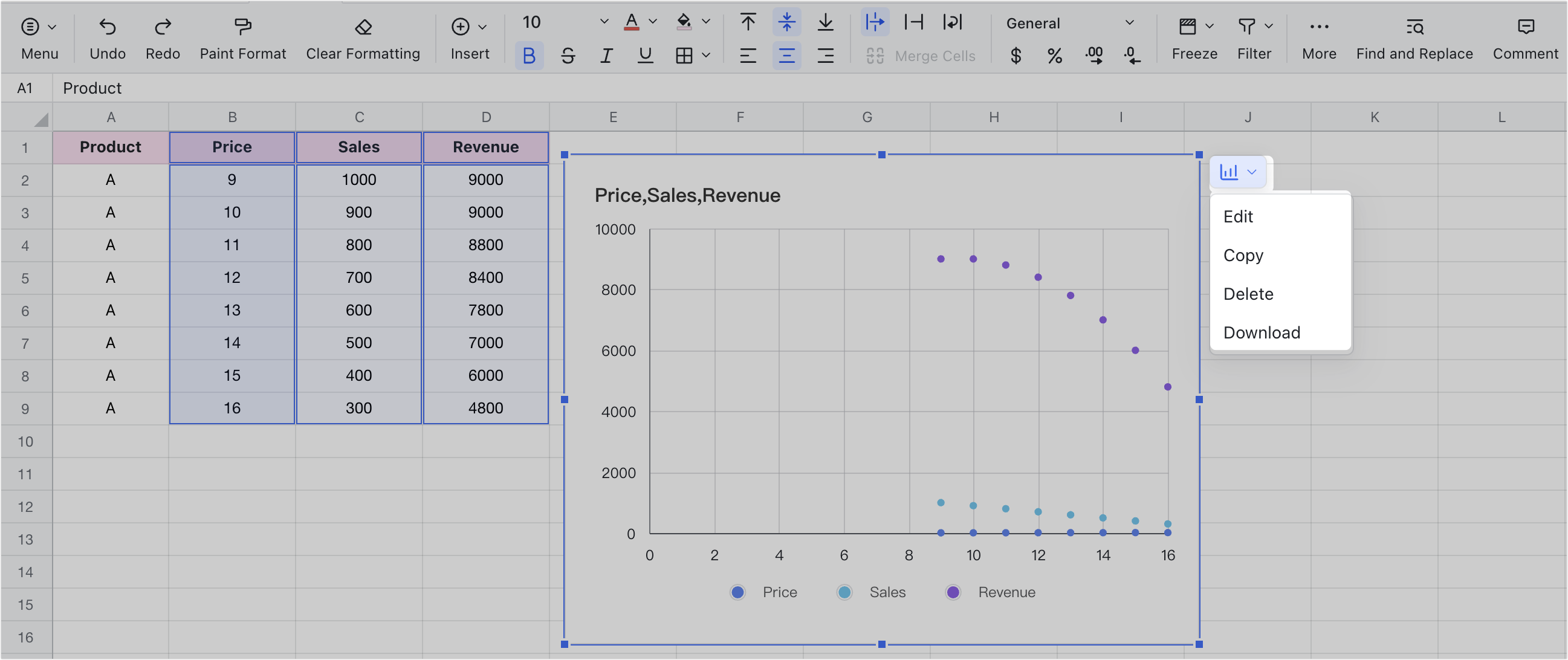
- Copy, delete, or download the scatter chart: Select the scatter chart and click the Column Chart icon in the upper-right corner, where you can edit, copy, or delete the scatter chart, or download it as an image.
250px|700px|reset