Image specifications for the Carousel block in Custom Workplace

Image specifications for the Carousel block in Custom Workplace

3 min read
💡
The Carousel block is currently only available for Custom Workplaces. For more on Custom Workplaces, see Custom Workplaces introduction. For more on the Carousel block, see the Use the Carousel block.
Managed by administrators, the Workplace Carousel is a digital spot for employees to learn about the organization's culture and read the latest bulletins, such as important news and event notices.
  • You can upload banner images to the Carousel block if you have a Custom Workplace. This article introduces the image specifications and includes some examples.
  • If you don't have a Custom Workplace, you can go to Workplace > Settings > Manage Carousel in your default Workplace to upload a banner image. For details, see Workplace Carousel specifications.
1. Image specifications
Dimensions
Format
Size
Background color
Button
Rounded corners
Transparency
Please refer to the recommended dimensions under Block settings.
Note: The recommended dimensions are not fixed, but change with the block size, page margins, and so on.
250px|700px|reset
JPG/PNG
Less than 3 MB
(Required to ensure image clarity)
No restrictions
The specifications for Custom Workplaces and default Workplaces are similar. See Button specifications for recommendations.
Not available
Not available
2. Recommended dimensions
You can set display banner images in two ways: Fill and Fit.
Display mode
Description
Example
Fill
The uploaded image will fill the entire block. The masked area may get cropped as the window resizes.
You can set it to crop images From left or From center. Please make sure that important content is not displayed in the masked area. For more image specifications, please refer to Image specifications for the Carousel block in Custom Workplace.
Note: The masked area will not necessarily be cropped entirely. The cropped area will be dependent on the adjusted screen size.
Crop from left:
250px|700px|reset
Crop from center:
250px|700px|reset
Fit
The uploaded image will automatically adjust its size based on the size of the window while maintaining its original aspect ratio.
Note: The image will not be cropped. The area surrounding the image may be blurred out when the image's aspect ratio doesn't match the window's (color from the blurred background comes from the image itself).
250px|700px|reset
When uploading banner images, administrators should select images of appropriate size and suitable for the selected cropping method (only in "fill"mode) based on the size of the block, page margins, and other parameters.
Desktop app
There are five different layout modules for the desktop app as shown below.
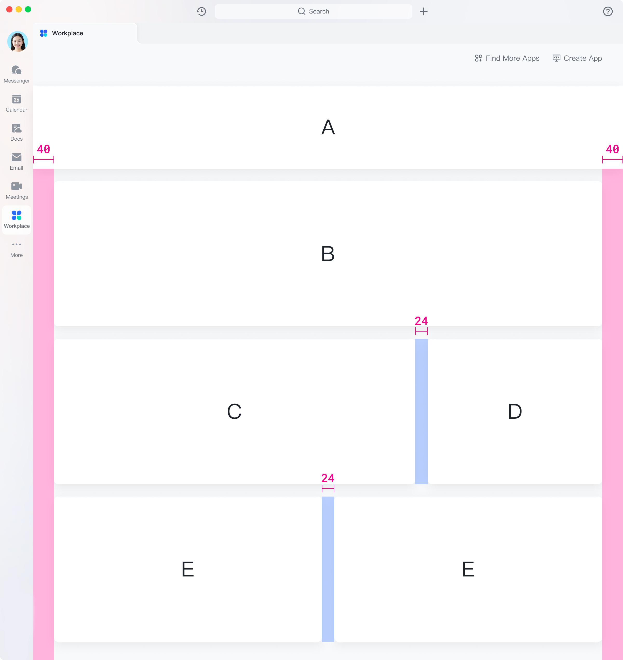
250px|700px|reset
This example shows the recommended values for banner images of various modules, which are calculated based on the default values (with the two side margins of the page at 40 px and modules' horizontal margins at 24 px). These margins can be changed in the editor. Follow the recommended dimensions for uploading images.
Module A
Module intro
Recommended dimensions: 3,288 × 720 px. Images cannot exceed 3 MB.
250px|700px|reset
Cropping (only in "fill"mode)
The shaded area will be cropped. Do not place important content or text in this area.
Crop from both sides
Crop from left
250px|700px|reset
250px|700px|reset
Module B
Module intro
Recommended dimensions: 3,048 × 720 px. Images cannot exceed 3 MB.
250px|700px|reset
Cropping (only in "fill"mode)
The shaded area will be cropped. Do not place important content or text in this area.
Crop from both sides
Crop from left
250px|700px|reset
250px|700px|reset
Module C
Module intro
Recommended dimensions: 2,008 × 720 px. Images cannot exceed 3 MB.
250px|700px|reset
Cropping (only in "fill"mode)
The shaded area will be cropped. Do not place important content or text in this area.
Crop from both sides
Crop from left
250px|700px|reset
250px|700px|reset
Module D
Module intro
Recommended dimensions: 967 × 720 px. Images cannot exceed 3 MB.
250px|700px|reset
Cropping (only in "fill"mode)
The shaded area will be cropped. Do not place important content or text in this area.
Crop from both sides
Crop from left
250px|700px|reset
250px|700px|reset
Module E
Module intro
Recommended dimensions: 1,488 × 720 px. Images cannot exceed 3 MB.
250px|700px|reset
Cropping rule (only in "fill"mode)
The shaded area will be cropped. Do not place important content or text in this area.
Crop from both sides
Crop from left
250px|700px|reset
250px|700px|reset
Mobile app
There are only two layouts available in the mobile app: Max-width and One-column.
Max-width layout
Module intro
Recommended dimensions: 1,272 × 450 px. Images cannot exceed 3 MB.
(The default height of each block in the editor is 280 px. For mobile display, we recommend changing the height of the Carousel block to 190 px. For instructions, see Use the Carousel block)
250px|700px|reset
Cropping (only in "fill"mode)
The shaded area will be cropped. Do not place important content or text in this area.
Crop from both sides
Crop from left
250px|700px|reset
250px|700px|reset
One-column layout
Module intro
Recommended dimensions: 1,176 × 450 px. Images cannot exceed 3 MB.
(The default height of each block in the editor is 280 px. For mobile display, we recommend changing the height of the Carousel block to 190 px. For instructions, see Use the "Carousel" block)
250px|700px|reset
Cropping (only in "fill"mode)
The shaded area will be cropped. Do not place important content or text in this area.
Crop from both sides
Crop from left
250px|700px|reset
250px|700px|reset
Written by: Lark Help Center
Updated on 2023-04-27
How satisfied are you with this content?
Thank you for your feedback!
Need more help? Please contact Support.
0
rangeDom